Personalized Crystal · November 18, 2026
How to Personalize a Crystal Award Without Overcrowding the Design
Learn how to balance recipient names, award wording, logos, and dates on a personalized crystal award. A practical guide to visual hierarchy, engraving space, and proof review.

A personalized crystal award should feel carefully composed, not like every available detail has been squeezed onto one surface. The challenge is not simply fitting the words. It is deciding what the recipient should notice first, what supports that message, and what belongs somewhere else.
A logo, recipient name, award title, achievement, date, and organization can all matter. They do not all need equal visual weight. A clear hierarchy makes the award easier to understand and gives the crystal design room to remain part of the presentation.
This guide focuses on the visual composition of a personalized crystal award: how to prioritize information, work with the shape and engraving area, keep branding in balance, and review the final proof without relying on a universal line or word limit.
Start with the one message the award must communicate
Before arranging text, write one sentence describing what the award is meant to recognize. That sentence is the decision filter for every detail that follows.
The main purpose might be to recognize a person's achievement, commemorate a company milestone, thank a client, or identify a championship winner. Each purpose changes which information deserves the strongest emphasis.
Ask three questions:
- What should the recipient understand immediately?
- Which detail makes this award specific to this person or occasion?
- Which information is necessary for identification, rather than essential to the message?
If a line does not answer one of those questions, consider moving it to the presentation card, certificate, event program, or spoken introduction.
Use a simple visual hierarchy
Most personalized award layouts become easier to assess when the information is grouped into three levels. The exact order depends on the occasion and the selected design, but the principle is to avoid making every line compete for attention.
1. The primary element
Choose one element to lead. It may be the recipient's name, the award title, the company milestone, or the event name.
For an individual recognition piece, the recipient's name often deserves the strongest typographic emphasis. For a commemorative company award, the organization or anniversary may be the central subject. For a championship trophy, the event or achievement may need to lead.
Do not make the logo, recipient name, award title, and date all equally prominent. Decide which one carries the main message.
2. The supporting recognition line
Use one concise line to explain why the award is being presented. This is where a role, achievement, milestone, or short expression of appreciation can add meaning.
Prefer a specific description over several generic adjectives. If the award is for a particular contribution, name that contribution briefly rather than adding a long paragraph.
3. The identifying details
The organization name, event year, date, department, or logo can complete the composition. Include only the details that help identify the presentation or connect it to the organization.
These elements should support the main message, not force the recipient's name or recognition line into a smaller space.
Decide what belongs on the crystal—and what belongs elsewhere
The physical award is a lasting object, but it does not need to carry the entire story behind the achievement.
Details that often belong on the crystal include:
- The recipient or team name.
- The award or achievement title.
- One short recognition statement.
- The presenting organization or event.
- A relevant year or date.
- A company or event logo, when it supports the design.
Long explanations, several project descriptions, multiple slogans, full lists of contributors, and extended thank-you messages may be better suited to a card, certificate, event program, or presentation speech.
This is not a fixed rule for every award. The right amount of information depends on the selected piece and its usable personalization area. The important point is to decide what the crystal needs to preserve, then give the longer context another place.
Let the crystal shape influence the layout
The same wording can look balanced on one award and crowded on another. A broad face, a narrow base, a tall geometric form, and a custom-cut silhouette do not provide the same visual space.
Before finalizing the text, review the actual product and ask where the inscription can be placed. Do not assume that the full front surface is available or that every design supports the same personalization method.
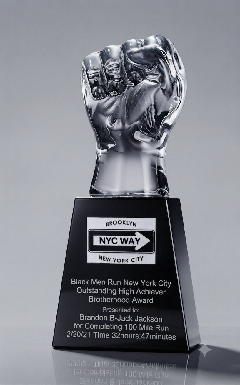
A sculptural award may use its silhouette as the main visual statement and keep the wording on a separate base. The BCA Custom Cut Out collection includes distinctive forms such as the X Award Series. For these designs, the outline already carries attention, so the inscription should be planned around the available base or engraving area rather than treated as an afterthought.
A more traditional or desk-oriented piece may offer a different arrangement. Compare the product's proportions and intended display setting before deciding how many lines to include.
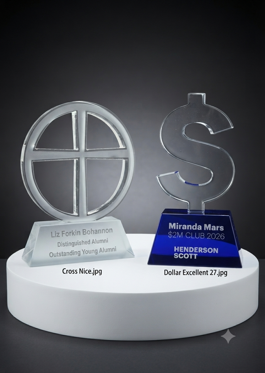
For an award that uses a more dimensional internal image, explore BCA's 3D Crystal collection. For a design where the physical outline is central, compare the Custom Cut Out Design collection. The available inscription area and personalization options still need to be confirmed for the specific piece.
Give the logo a clear role
A company logo can identify the organization behind the recognition, but it should not automatically become the largest element on the award.
Decide what the logo needs to do:
- Identify the presenting organization.
- Connect the award to a company or event brand.
- Support a custom concept where the logo or symbol is part of the design.
- Provide a consistent mark across a group of awards.
If the recipient's achievement is the main reason for the presentation, the name and recognition line should remain easy to find. If the award commemorates the organization itself, the company identity may take a more prominent role.
Avoid adding several logo versions, taglines, department marks, and event sponsors unless each has a clear purpose. If multiple identities are required, ask the design team to review the hierarchy before artwork is finalized.
Best Crystal Awards asks customers to provide a true PNG or PDF logo file. Send the current approved version and explain which organization or event it represents. For more detail on choosing a design around a company mark, read Custom Crystal Awards: How to Choose the Right Design for Your Company Logo.
Keep typography disciplined
Typography should make the message easier to follow. Too many font styles, decorative treatments, or competing emphasis choices can make a small inscription feel busy.
A practical approach is to:
- Use one clear style for the main name or title.
- Use a complementary, readable style for supporting information.
- Reserve decorative lettering for a short element if it suits the design.
- Avoid setting every line in bold or all capitals.
- Keep long messages out of highly decorative styles.
- Check that punctuation, capitalization, and line breaks are intentional.
There is no universal font size or line count that works for every crystal award. The product dimensions, engraving area, process, and viewing distance all matter. Ask for a layout review when you are unsure whether the wording will remain legible on the selected piece.
Use spacing to separate ideas
Crowding often happens because information is added without reconsidering the space between elements. Even when the wording is short, a logo, name, title, and date can feel like one dense block if they are not visually separated.
When reviewing a proposed layout, look for:
- Clear space around the outside of the inscription.
- A visible distinction between the main name or title and supporting details.
- Line breaks that separate different kinds of information.
- Consistent alignment where it helps the composition.
- Enough room for the logo to remain recognizable.
- No text placed so close to an edge or design feature that it feels cramped.
Do not solve every spacing problem by shrinking all the text. First remove information that is not essential, then reconsider the hierarchy and line breaks. If the layout still feels tight, discuss a different product shape or a shorter message.
For multiple awards, create one layout system
A group order may need the same logo and design with a different recipient name, award title, or achievement on each piece. Treat the layout as a system rather than designing every inscription from scratch.
Decide which elements remain consistent:
- Logo position.
- Award title or recognition category.
- Organization or event name.
- General type hierarchy and alignment.
Then identify the fields that change for each recipient. Prepare one checked list with a separate row for every award, and keep the wording structure consistent where appropriate.
A shared layout helps the set feel coordinated, but do not force every inscription to use exactly the same number of lines if the names or achievements differ. Review the longest and shortest examples before approving the full batch.
Review the digital proof as a finished composition
The proof is where you should assess the complete arrangement—not only whether the words are spelled correctly.
Review it in this order:
- Message: Is the main reason for recognition immediately clear?
- Hierarchy: Can you identify the primary element, supporting line, and secondary details?
- Logo: Is the correct version used, and does it have enough room?
- Readability: Are names, titles, dates, and line breaks easy to follow?
- Balance: Does the text work with the crystal shape rather than compete with it?
- Accuracy: Do all names, dates, organization details, and quantities match the approved brief?
Ask the responsible decision-maker to consolidate feedback before sending corrections. Peter Johansson says digital proofs usually take about one day to prepare. His stated text-change policy is that one text change is accepted; a second text change incurs a $90 art charge. Finalize the wording as carefully as possible before artwork begins.
For a more detailed checklist covering file preparation, recipient information, and proof approval, see How to Prepare Artwork and Personalization for Custom Crystal Awards.
Allow time for the selected design and delivery route
A layout decision can affect the design you choose, and the design can affect the schedule. Peter notes that Cut Out Series and number cut-outs are popular, but these styles can require additional production time. If you choose a distinctive cut-out form, discuss the design and required date together rather than assuming it follows the same schedule as a standard piece.
Peter's standard planning guidance is about two weeks of production after proof approval, followed by around one week of FedEx Air transit. Some complex pieces may need approximately three weeks of production. Separate shipping estimates include 3–6 days for US FedEx Ground and 5–7 days for international negotiated FedEx shipments. These are estimates for different services and destinations, not guaranteed delivery dates. Confirm the full schedule for the selected award and destination.
Personalized crystal award layout checklist
Before approving the proof, confirm:
- One clear message leads the design.
- The recipient name or main award title is easy to identify.
- The recognition line is concise and specific.
- Only necessary dates, organization details, and logos are included.
- The selected product has a suitable area for the requested personalization.
- The logo is the correct version and supplied as a true PNG or PDF.
- Typography and line breaks are consistent and readable.
- The inscription has enough breathing room around it.
- Every recipient's details match the approved master list.
- One responsible person has reviewed and approved the complete proof.
- The design and delivery estimate have been discussed for the required date.
Helpful answers
Frequently asked questions
How much text can fit on a personalized crystal award?
There is no single word or line limit that applies to every design. The usable area depends on the award's shape, dimensions, and personalization method. Choose the essential message first, then ask the team to review the wording against the specific product.
Should the company logo be larger than the recipient's name?
Not automatically. If the award recognizes an individual's achievement, the recipient and the reason for recognition should remain easy to notice. If the award commemorates the organization itself, the company identity may deserve more emphasis. The layout should follow the purpose of the award.
Can I use the same design for several recipients?
A shared design can create a coordinated set while allowing names or achievement details to change. Provide one verified recipient list and ask the team to review the longest inscription as well as any meaningful variations.
What logo file should I provide?
Best Crystal Awards asks for a true PNG or PDF logo file. Identify the approved version and send it with the final wording and design reference.
How long does it take to receive a proof?
Peter Johansson says digital proofs usually take about one day to prepare. The complete order schedule is separate: standard production is about two weeks after proof approval, plus around one week of FedEx Air transit. Some complex designs may need three weeks of production, so confirm the estimate for the specific order.
Made for meaningful recognition
Ready to make an achievement memorable?
Share your event, design direction and timeline. Our team can help you explore a fitting crystal award.
Discuss your award project →